Data source is from John Hopkins, itself accumulating data from WHO and many national governments
I am using death totals, rather than confirmed infections, because the latter are entirely too dependent on testing policies. Most nations have a critical shortage of testing ability, but not all have the same degree of shortage, and they have thus all made different choices as to who to test. This means that the numbers infected, is more a measure of the national policy and capability in regards testing, than it is of how far the disease has spread. Death totals are probably not perfect either, but they are almost certain to be more reliable than the data for number infected.
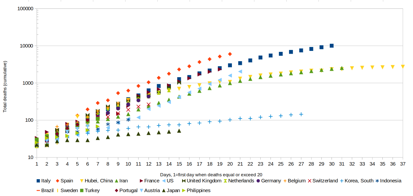
Only showing the top 20 nations, time-shifted so that Day 1 is the first day the death toll reached at least 20. This is partly for reasons of the data (Hubei's data starts around then), but it also probably helps to show the trend only once we got into a truly exponential-spread phase. Note that the y-axis is LOGARITHMIC, which makes sense for plotting exponential processes but is important to notice (see the numbers on the y axis). Also note that the y-axis is cumulative, i.e. that's not how many people died that day, but rather how many total had died by that day. So, the fact that the lines keep going up doesn't mean the daily totals are always going up; it's the cumulative total as of that day. China data is just from the province of Hubei, where the most deaths occurred, and where the pandemic appears to have started.
Long story, short: Iran is on the same path as Hubei (the epicenter). France is on almost exactly the same path as Italy, as is most of Europe, Spain is considerably worse. Switzerland somewhat better.
Indonesia looking somewhat better than most, South Korea better than that, and whatever it is that Japan has going for it, we all need to move there.
The U.S.A., as usual, is a weird case. We were looking somewhat better than most, but then kicked it into high gear about a week and a half ago.
At some point, it makes sense to switch from looking at absolute numbers, to looking at deaths as a percentage of the total population. This would occur once we get out of the almost-everyone-is-uninfected phase into the significant-numbers-have-had-it phase. Unfortunately we don't know much about how close we are to that, except for Iceland, and they were maybe around 6% infected as of Mar 27 or so but could easily have been slower to get it than Europe or North America, which have more visitors from China and other early countries. So, we look at both graphs.
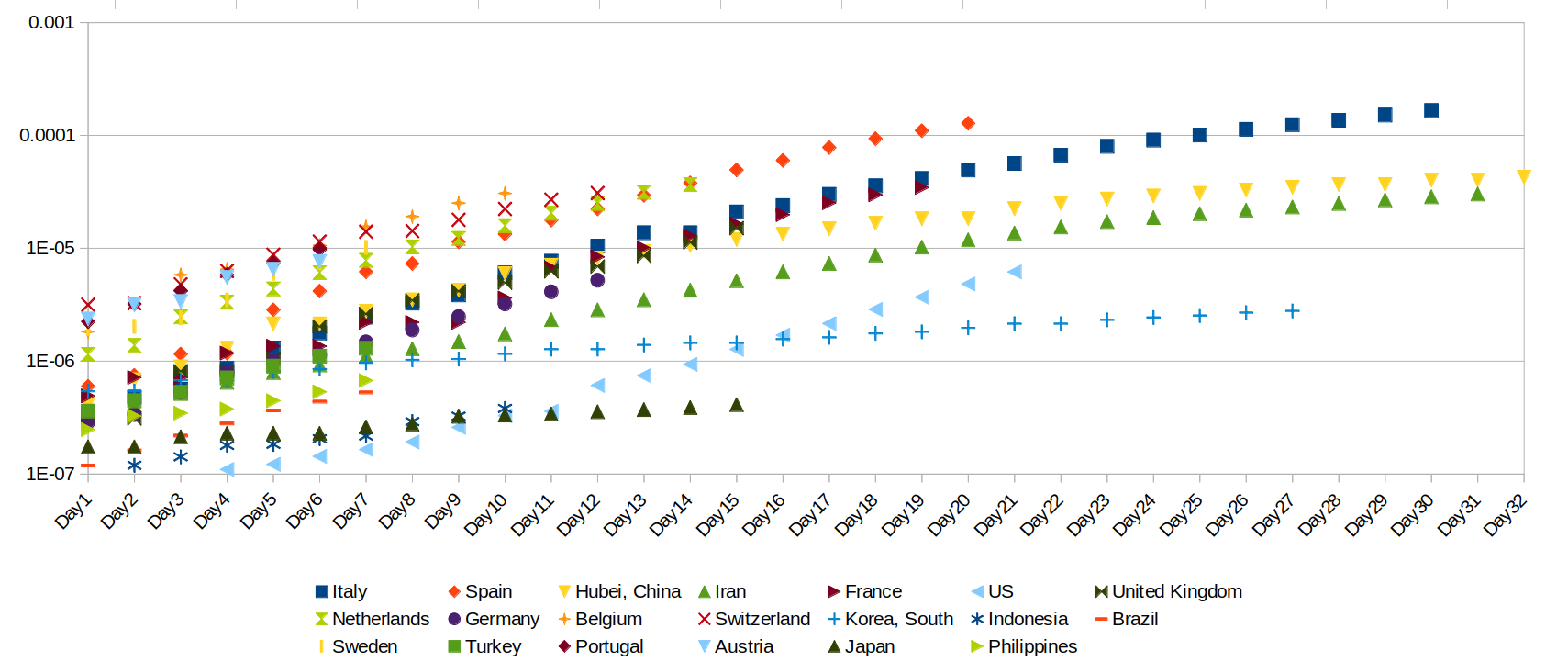
Note that, because Day1 is set at whenever that nation/province got to 20 deaths, the left-hand part of this graph is kind of skewed. Of course the Netherlands starts out higher (as a % of total population) than Spain, it's a smaller country and we're around 20 deaths at Day1 for every country by definition. As each country moves out of the initial phase into the some-people-have-already-had-it phase, this should matter less and less, so the middle and right hand parts of the graph are more significant here.
Japan still looks unusually good, Spain still looks unusually bad, but Switzerland not looking so great in this view. Netherlands looks on the same path as Spain, but maybe flattening faster. The U.S.A. is still an oddball.
My only guess as to why the U.S.A. looks odd, is that we are actually the sum of a few different points of entry (e.g. east and west coast), and so as you move along in time you go from one exponential growth pattern (West Coast) to the sum of several exponential growth patterns. But, just a guess.
The thing that you DON'T see, here, is any evidence of a change in the pattern in response to changes in policy, social distancing, etc. This could be because it isn't being done well enough, it could be because the virus can spread between apartments even if you stay home, it could be because delivery packages can transport it, or maybe it will work eventually but takes longer than 2 weeks to show up in the deaths for some reason.
Demographics doesn't seem to be an especially good predictor. Why is Japan doing better than Indonesia, when it has an older population?
The main thing that leaps out is, the closer the nation is to Japan, the better off. Indonesia, Japan, and South Korea had dramatically different responses to the virus, almost the full spectrum from fairly strict and lots of testing (South Korea) to fairly lax and not much testing (Japan). On the other hand, within Europe there is a lot of variation in policy between lots of restrictions (Italy, Spain, France) or not as many (Netherlands, UK). But policy doesn't seem to be a great predictor of outcome. What seems a better predictor, is how close you are to Japan.
Which suggests, that perhaps viruses similar to the one that causes Covid-19, have emerged from Japan (or somewhere close to it) in the past, and the nations which have been through it before, have a better resistance to it. We European-descended folks, are now in a position somewhat similar to the colonists who went into tropical regions with lots of malaria, and found that they had less resistance to it than the locals.
On the other hand, none of these nations, including the ones with relatively lax policies or less well equipped medical infrastructure, appear to be on a trajectory that will take them up to 0.1%. That doesn't mean it's ok; 0.01% of the people dying is still really bad. But some of the predictions we had of 1-2% deaths of the population do not, at this point, seem like they are going to happen, even in the countries with relatively lax policies or poor medical infrastructure.