So, there are still some hard times ahead for some families (this is always true, actually), but we have pretty clearly passed the peak mortality in a number of countries now. So, let's take a look at what that looks like.
I'm using the number of deaths, here, not the number of cases, recovered, etc. The issues with testing numbers seem to grow more numerous as time goes by, even more so when comparing between countries. Dead people are, however, defined more similarly in different countries. There are still issues with regard to defining who died as a result of Covid-19; for example, if they had both it and the flu, which one killed them? However, the issues with testing of the sick and/or asymptomatic are even worse. We'll scale each country's data by their population, so that they are at least somewhat comparable. Instead of starting on the same date for each, the graphs will start on the first date at which the total deaths had reached a level of 1 in a million.
So, let's take a look at the three countries outside of China about which we first heard of significant numbers of deaths from Covid-19: South Korea, Iran, and Italy.
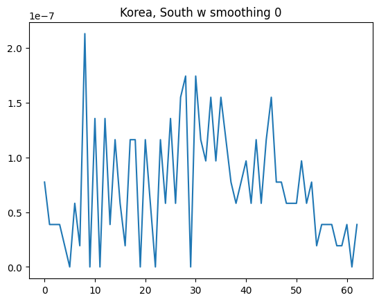
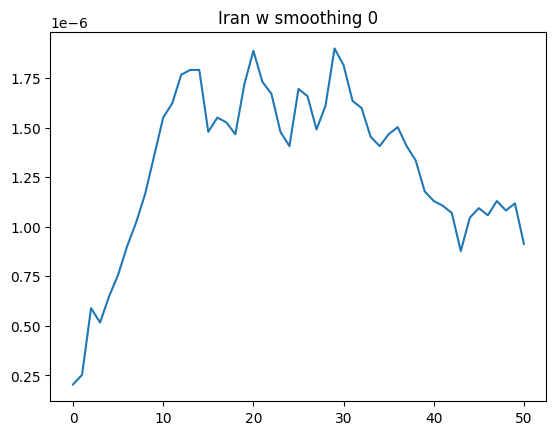
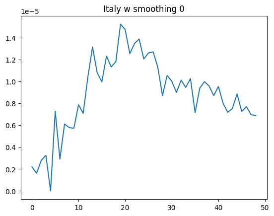
The first thing you notice is that the overall shape of the curve is not all that different; sharper to climb, slower to descend, but all three clearly past their peak. The second thing you notice is the scale on the y axis. That is in proportion to their population, so "1e-5" means 1 per 100,000 people, "1e-7" means 1 per 10 million people. Italy is doing about 10x worse than Iran, which is in turn doing about 10x worse than South Korea. That's a huge difference. Per capita, we can expect the final totals for South Korea to be about 1% of the final totals for Italy.
So, now let's take a look at some truly big countries: India, the U.S., Indonesia, and Brazil. We're not looking at China, both because the controversy surrounding their numbers just confuses the issue, and because as the first nation to be hit with the virus they are a special case. For the record, if we included China's numbers it wouldn't look all that different from other countries in the region. But let's leave them out of this analysis.
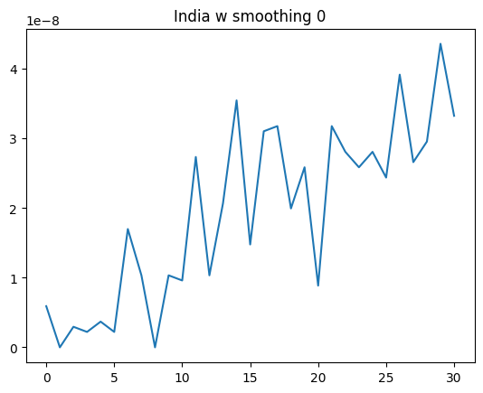
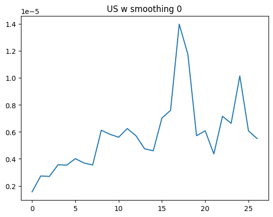
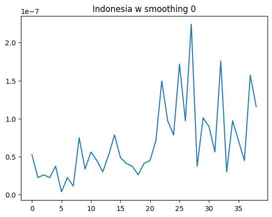
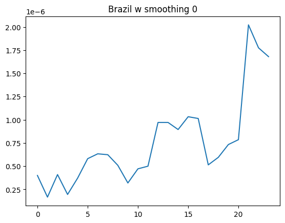
India and Brazil might not be past their peaks yet, but it's pretty clear that the US and Indonesia are. It's also pretty clear that, here again, we see somewhat similar shapes, but orders of magnitude difference in the height of the peaks. Indonesia's peak is 1% of the size of the peak for the U.S. Whatever you think of the respective medical systems, testing regimes, policies regarding lockdown, etc., it is not at all clear why Indonesia is 2 orders of magnitude better off.
If you like Indonesia's policy choices, one would be tempted to take this at face value. On the other hand, if you don't like Indonesia's policy choices, one is tempted to attribute it to faulty reporting. But let's see if there are any patterns in the data that do a good job of explaining things, before we decide to ignore any data we don't like.
Some cases, instead of being of weirdly different magnitudes, instead looking weirdly similar.
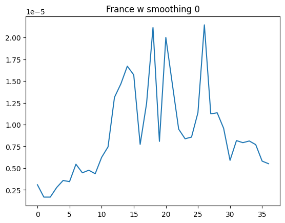
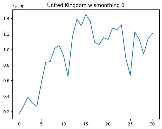
They are different in how "spiky" they are, but in terms of the peak values, they are quite similar. Now, whatever you think of the policies of Italy, France, and the UK, the one thing you cannot call them is "quite similar". The UK started with a policy based on "herd immunity", then lost their nerve and switched to a lockdown. Italy used a region-by-region lockdown, starting in the north and then spreading to the rest of the country. France locked everything down, earlier on in their outbreak than either Italy or the UK (although later in absolute terms than Italy, which got hit earlier than France did). Yet, they all peaked at around 1.5 per 100,000 people, after 15-20 days, and subsided more slowly than they rose.
What would it look like, if we found an affect that actually made a big impact? Given that, apparently, policy doesn't show much impact, and neither does income level (and thus presumably how well-equipped the health care infrastructure might be), what would it look like if we found a factor that actually showed a big impact? Well, it would look like this.
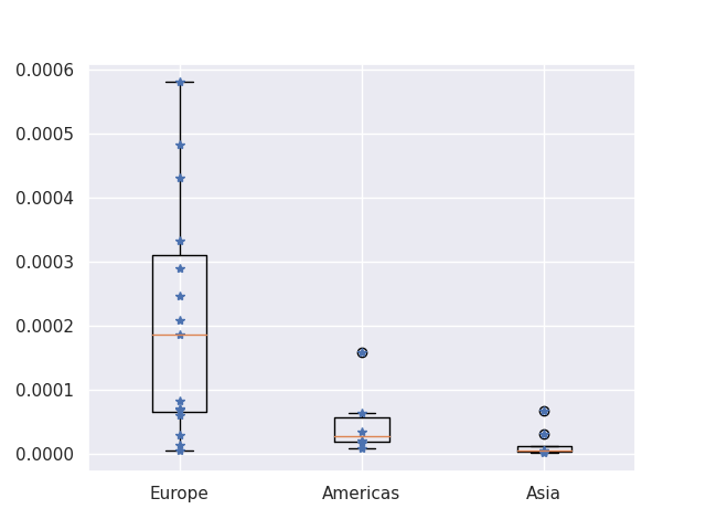
That, my friends, is what a real impact is. This is a boxplot; the yellow lines mark the median value for that group, and the box encloses the 25th to 75th percentile (i.e. the middle half of that group's data). It's a standard way of comparing distributions. Or, you can just look at the blue stars, which mark the actual data points. You can stop squinting your eyes and looking sideways at the difference between Sweden, France, and Germany, or perhaps the difference between South Korea and Japan. Compared to this affect, there is no difference. It looks even bigger if you break out western Europe from eastern Europe (Russia and Romania are two of the lowest totals in Europe). You can also stop beating up on Italy's choice of when to lockdown, or berate Sweden for not doing it, or trying to come up with a reason why France's lockdown didn't work, because none of that is what is driving this bus. What is determining the order of magnitude of how many people will die in each country, is what part of the world they're in.
Normally, when we say "what part of the world", we mean something like, "in the rich part or the poor part". But here, Japan and the Phillipines look a lot more alike, than either one does to France. France and Spain look a lot more alike, than either one does to Brazil. Brazil and Canada look a lot more alike, than...but you get the idea. Heck, in this case, Australia looks very Asian, so it's not even genetic.
The problem is that this factor doesn't make any sense. How can longitude be more important than your health care system? How can longitude be more important than genetics? How can longitude be more important than whether you let schools stay open, or told everyone to stay inside? You got me. But none of those things seem to matter, for Covid-19 death totals, nearly as much as what time zone you're in.