So a combination deli/bakery/giftshop was kind enough to let me take a look at their sales data for the last several years. It is an interesting case to compare to my previous post, in which I looked at a small retail clothing store. Obviously food and clothes would be expected to have different buying patterns, but maybe not entirely different.
So, I tried to use functions more this time, as R seems to lend itself naturally to functional programming. In the 1st script, to turn the data from the csv into a dataframe, we have the following functions:
You can see the code here. Since a lot of it is similar to what I have blogged about before, I'll mostly spend time on the analysis.
All sales data has been scaled so that the results are between 0 and 1 for each category in each day. However, they are scaled by the same factor, so you can still compare between categories, and between days.
The heart of the second program is the function "create_model". The idea is that we are going to create models, using the lm() linear model function, to predict each sales category (donuts, bakery, cookies, etc). We split the data into df_pre and df_post, based on a cutoff date. The df_pre data will be used to create the model, and then the df_post data will be used to evaluate how well we have done.
create_model            <- function(df_pre,df_post,target_col_name,noisy,logfilepath) {
    #here we make the actual model
    model = lm(df_pre[[target_col_name]] ~ weekday+week+month+lastdayofmonth+day_tot+holiday+misc+(week*weekday*month),data=df_pre)

    #we calcualted some measures of model fit, and save that to a logfile
    r_sq_rpt  <- paste('Model for ',target_col_name,'\nR-squared',summary(model)$r.squared,'\nAdjusted R-squared',summary(model)$adj.r.squared)
    write(r_sq_rpt,file = logfilepath,append=TRUE)

    #saving the model allows us to easily use it in a later script
    saveRDS(model, file = paste("./models/lm",target_col_name,".rds", sep = ""))

    #now we see how this model does at predicting the data after the cutoff date, and write those to the logfile as well
    suppressWarnings(df_post$pred_val            <- predict(model, df_post))
    pred_r_sq_header    <- paste('R-sq of predictions to actual for data after ',cutoff_date)
    write(pred_r_sq_header,file=logfilepath,append=TRUE)
    pred_r_sq           <- cor(df_post[[target_col_name]],df_post$pred_val   )^2
    write(pred_r_sq,file=logfilepath,append=TRUE)
    print(paste(target_col_name,summary(model)$r.squared,summary(model)$adj.r.squared,pred_r_sq))

    return(model)
}
I already knew, from communication with one of the bakery owners, "we have more deli options and coffee drinks, curious if they have trends". In other words, there was reason to suspect that the models would _not_ predict recent sales well for the deli and beverage categories (if the changes had actually done anything). The timing of these changes was somewhat uncertain, but "The [adding of more options to the] deli was about 2 years ago. Beverages have been mostly the same I guess maybe 3 years ago for espresso- but when deli options got added the front started pushing more flavors of drinks."
When we run the second script, which creates (and saves for future use) these models for each category, the output is the following:
| Category | R-squared | adjusted R-squared | R-squared for predictions after 2017-09-01 |
|---|---|---|---|
| total_sales | 0.829000386046707 | 0.783450270539498 | 0.707390064053105 |
| beverage_all | 0.754806883682838 | 0.689493433484816 | 0.0253577757697228 |
| breads_togo | 0.790460526898262 | 0.734644335373345 | 0.471625377416438 |
| cakes_togo | 0.586755203005008 | 0.476676894635163 | 0.165520777420259 |
| cookie_all | 0.815234938150361 | 0.766018043945872 | 0.673777041992749 |
| deli | 0.645229392410933 | 0.550727178162317 | 0.111756111178605 |
| donut_all | 0.219249247929802 | 0.0112763401731117 | 0.0414259615906176 |
| freezer_togo | 0.763890349349901 | 0.700996512277168 | 0.616096681400651 |
| nonfood | 0.645535695799243 | 0.551115073282884 | 0.411272144658627 |
| pastry_all | 0.57583415266954 | 0.462846743555313 | 0.194082832243026 |
Each line says what category of sales this model is for, what the model R_squared was, what the adj_R_squared was, and what the R_squared was if we used that model to make predictions about the df_post data. Looking over these results, we see a few broad trends. Donuts is just not very well modelled, period. Others, like breads and nonfood, are predicted well enough to be useful, but less than 0.5 R-squared for the df_post data. Other, like beverages, cakes, deli, and pastry, were reasonably well modeled for the df_pre data, but then did not perform well at all for the later, df_post data. Two of these, beverages and deli, might be due to the changes which the owners told us about (see above). Then the categories of cookies and freezer_togo seemed to be done pretty well, with an R_squared over 0.6 even for the df_post data.
Lastly, the total_sales had the best results of all, with an R_squared of over 0.7 even for the df_post data, indicating that some of the "noise" from the different categories might have been shifting tastes over time, such that a decline in one category might simply result in an increase in another, giving a lower R-squared to each category than to the total_sales.
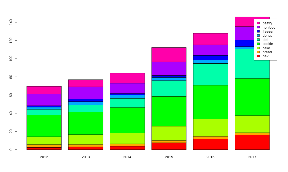
The second R script saved the lm models for each category (and for total_sales), and then a third R script loads these in and creates some plots. First of all, it is worth looking at how important each category is to the overall sales, and how that importance has changed over time. For this purpose, I am using only data from 2012 to 2017, since 2011 and 2018 would be only partial years.
barplot_all_cats        <- function(c_data) {
    image_pathname      <- './plots/barplot_of_mix.png'
    png(image_pathname, width = 1000, height = 600)
    c_data$year         <- substr(c_data$salesdate,1,4)
    df_12on             <- c_data[which(c_data$salesdate >= as.Date("2012-01-01", format = "%Y-%m-%d")),]
    df_12to17           <- df_12on[which(c_data$salesdate < as.Date("2018-01-01", format = "%Y-%m-%d")),]
    tbl                 <- t(as.table(as.matrix(aggregate(cbind(beverage_all,breads_togo,cakes_togo,cookie_all,deli,donut_all,freezer_togo,nonfood,pastry_all) ~ year,data=df_12to17,sum))))
    myplot              <- barplot(tbl[2:10,],col=rainbow(9),names.arg=c(tbl[1,]),legend=c("bev","bread","cake","cookie","deli","donut","freezer","nonfood","pastry"))
    print(myplot)
    garbage <- dev.off()
}
Even from this simple plot, we can already see a few key points. Cookies are the most important, but both deli and beverages have become significantly bigger in the last few years.
Before we look at individual categories, we can look at all of them together in a couple more ways. For example, how does the mix change over the course of the year?
plot_all_cats_dotm_vs_month                      <- function(cutoff_date) {
    image_pathname      <- paste('./plots/all_cats_sales_dotm_v_month_since_',cutoff_date,'.png',sep="")
    png(image_pathname, width = 1500, height = 600)
    if (cutoff_date == 'ever') {
        df              <- c_data
    } else {
        df              <- c_data[which(c_data$salesdate >= as.Date(cutoff_date, format = "%Y-%m-%d")),]
    }
    myplot              <- ggplot(data = df) +
      labs(x = 'day of the month',y = 'sales by category') +
      geom_smooth(method='loess',mapping = aes(x = dotm,y = beverage_all,colour = "bev")) +
      geom_smooth(method='loess',mapping = aes(x = dotm,y = breads_togo,colour = "bread")) +
      geom_smooth(method='loess',mapping = aes(x = dotm,y = cakes_togo,colour = "cakes")) +
      geom_smooth(method='loess',mapping = aes(x = dotm,y = cookie_all,colour = "cookie")) +
      geom_smooth(method='loess',mapping = aes(x = dotm,y = deli,colour = "deli")) +
      geom_smooth(method='loess',mapping = aes(x = dotm,y = donut_all,colour = "donut")) +
      geom_smooth(method='loess',mapping = aes(x = dotm,y = freezer_togo,colour = "freezer")) +
      geom_smooth(method='loess',mapping = aes(x = dotm,y = nonfood,colour = "nonfood")) +
      geom_smooth(method='loess',mapping = aes(x = dotm,y = pastry_all,colour = "pastry")) +
      scale_colour_manual(name="legend", values=c(bvc,brc,cac,ckc,dlc,dnc,frc,nfc,psc)) +
      coord_cartesian(ylim=y_limits) +
      facet_wrap(~ month, nrow=2)
    print(myplot)
    garbage <- dev.off()
}
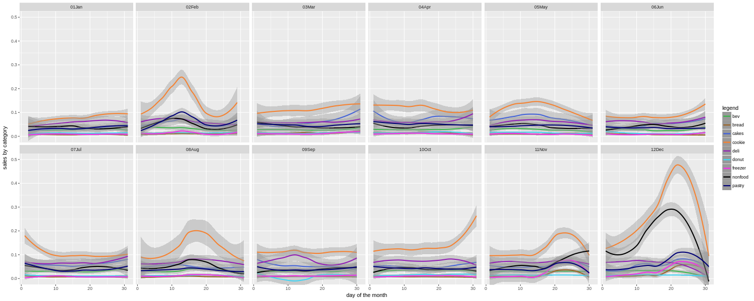
Here we are using ggplot to best affect, and it can really be powerful. Putting all of the category sales together here allows us to quickly see that cookie sales have some big spikes around a few holiday times (Valentine's Day, Thanksgiving, Christmas), and also in mid August around the start of the school year. The bakery in question is in a college town, so there is an influx then of parents dropping off their college age children, and apparently buying them a lot of cookies as well. Or who knows, maybe buying cookies for themselves on the way out of town.
We also see that nonfood (cards, crafts, gifts, etc.) becomes a much bigger part of the mix during the traditional Christmas shopping season, than at other times of the year. In fact, in general, the relative importance of the different categories shifts around a lot during different times of the year. If you are basing your estimates of how much to prepare for each category based on the yearly totals, or even just on what happened last week or last month, you can be off by a lot. In a restaurant or bakery, minimizing waste while maximizing sales can be a tricky business. Hopefully the owners will find this kind of guide useful when deciding where to focus their efforts from one week to the next.
Note also that this is for all years' data put together. We also made them more detailed charts for only the last couple years. The advantage is that you can pick up on shifting tastes, as for example if people eat fewer donuts and more cookies. The disadvantage is that you have less data to go by.
We can also look at the sales for all categories by day of the week.
png('./plots/all_cats_sales_dotw_v_dotm_faceted.png', width = 1000, height = 600)
ggplot(data = c_data) +
  labs(x = 'day of the month',y = 'category sales') +
  geom_smooth(method='loess',mapping = aes(x=dotm,y=beverage_all,colour="bev")) +
  geom_smooth(method='loess',mapping = aes(x=dotm,y=breads_togo,colour="breads")) +
  geom_smooth(method='loess',mapping = aes(x=dotm,y=cakes_togo,colour="cakes")) +
  geom_smooth(method='loess',mapping = aes(x=dotm,y=cookie_all,colour="cookie")) +
  geom_smooth(method='loess',mapping = aes(x=dotm,y=deli,colour="deli")) +
  geom_smooth(method='loess',mapping = aes(x=dotm,y=donut_all,colour="donut")) +
  geom_smooth(method='loess',mapping = aes(x=dotm,y=freezer_togo,colour="freezer")) +
  geom_smooth(method='loess',mapping = aes(x=dotm,y=nonfood,colour="nonfood")) +
  geom_smooth(method='loess',mapping = aes(x=dotm,y=pastry_all,colour="pastry")) +
  scale_colour_manual(name="legend", values=c(bvc,brc,cac,ckc,dlc,dnc,frc,nfc,psc)) +
  facet_wrap(~ weekday)
garbage <- dev.off()
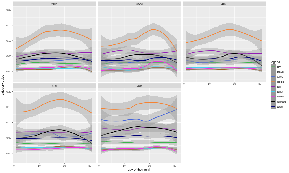
There are a few things that jump out of this. First, while cookies are the biggest category for most of the month, they are especially dominant around the 15th-25th for some reason. There is a bit of a falloff towards the end of the month. I expect this hypothesis would need to be examined more closely, on a per month basis, before drawing any conclusions. For example, Thanksgiving and Christmas both fall in this part of the month. Secondly, the mix really changes on Saturdays, with cookies still the biggest but other categories (e.g. cakes) making up a much bigger part of total sales.
We won't go into the details of every category here, but let's look at a few examples. First, beverages, which is one of the categories that the store's owners were curious about (because changes had been made in the last few years).
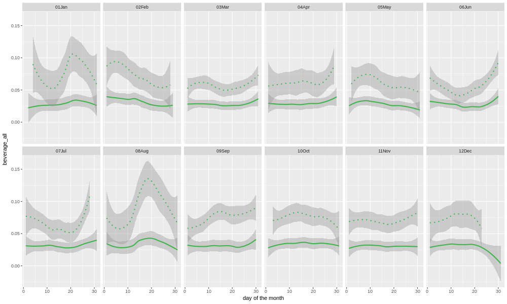
Here we plot the sales of beverages for each month, for each day of the month. The solid line shows data from all years, and the dotted line is the last 12 months' worth. Most of the individual points would be expected to fall within the area shaded gray. The gray band is wider for the single year's worth of data, than for all the years together, because there is less data, and so the confidence intervals are wider. Clearly, the sales have been higher in the last year than the overall historical average. But, is that just a long-term upward trend, or did something special happen?
For each category, we have a model, you may recall, so we can plot the predictions for that model against the entire store's history. Since the model does not know about any changes (e.g. adding espresso drinks), we may learn something from the comparison of the actual data to the model's predictions.
act_v_pred_by_day_tot   <- function(c_data,target_output,model) {
    image_path          <- paste('./plots/',target_output,'_act_v_pred_by_total_days.png',sep="")
    png(image_path, width = 1000, height = 600)
    myplot              <- ggplot(data = c_data) +
      labs(x = 'days since store opened',y = target_output) +
      geom_smooth(method='loess',mapping = aes(x=day_tot,y=predict(model,c_data),colour="predicted")) +
      geom_smooth(method='loess',mapping = aes(x=day_tot,y=c_data[[target_output]],colour="act")) +
      scale_colour_manual(name="legend", values=c("red","blue"))
    print(myplot)
    garbage             <- dev.off()
}
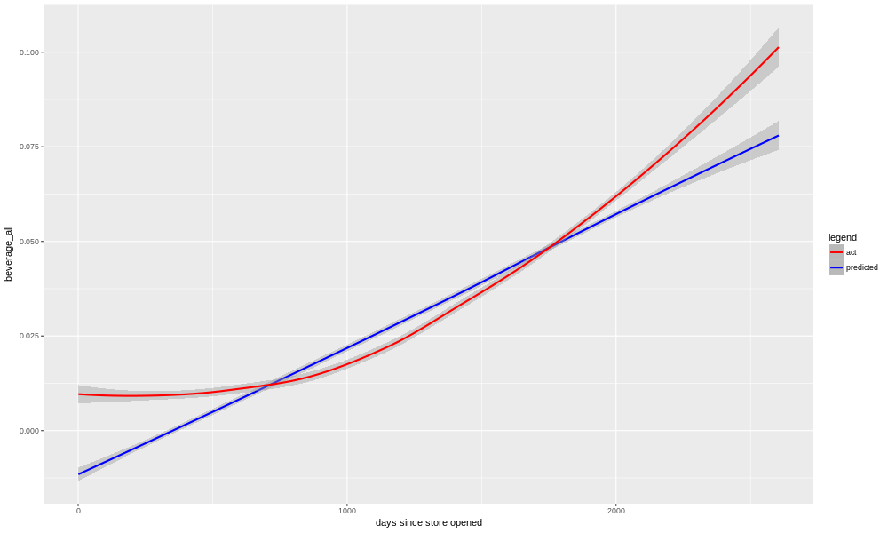
Sure enough, we see that in reality we had several years of flat to no-growth, and then starting a few years back things began increasing. The model is unable to match this exactly, so it more or less splits the difference, picking a nearly linear trend. Early and late in the store's history it is underestimating, and in the middle period it is overestimating.
There are a few things we could do to correct this. One, we could put a squared term for "day_tot" into the model, so that it could better match the non-linear shape of the real data. The problem with this is that, if we use that model for forward prediction, it would expect the beverage sales to continue to grow at an ever-faster pace. This is unlikely to be true (although it would be awesome).
Another possibility is to put a new boolean into the model, something like "espresso_available", and see if the restaurant owners can make a best guess as to when that change happened. Then, perhaps we would need an interaction term (between "day_tot" and "espresso_available") in the model. This could help, but the restaurant owners don't necessarily remember when that change happened. In addition, there may have been more than one qualitative change to the situation with beverages; the restaurant owners raised the possibility that when they added more deli options, the beverage sales might have increased partly as a consequence.
Most likely, the thing to do would be to just admit that the system we are modelling here, beverage sales at this bakery/restaurant, has changed, and the older data may be doing more harm than good. It might be safest just to use only the last couple years' worth of data, for modelling purposes.
In my case, this isn't even necessary. The question from the restaurant owners was whether or not their impression that things had changed with beverages, was correct. Was it just going up along with everything else, as the restaurant become better known? Or did it go up faster than that? The answer is yes, it definitely has gone up faster in the last few years than one would have expected based on previous history.
Let's look at another category that the owners asked about, the deli sales.
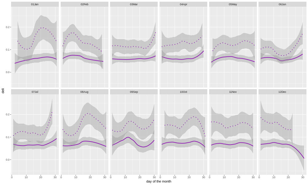
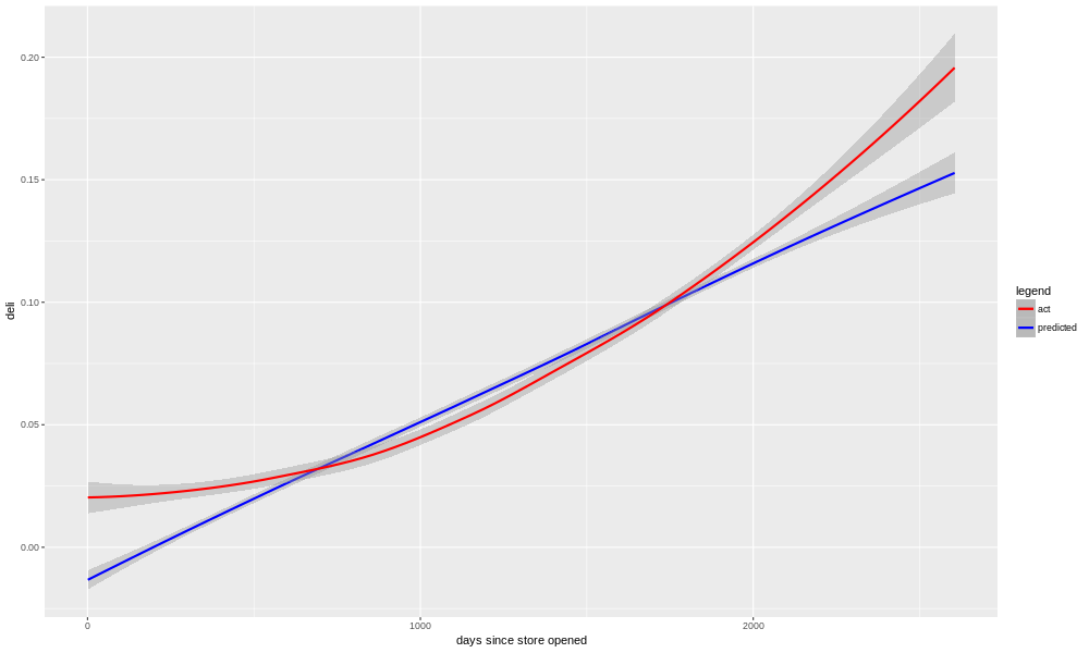
We can see here a very similar pattern. In fact, the crossover point when sales begin to outperform the model prediction is almost the same as we saw with beverages. This adds weight to the owner's speculation that there was synergy between the deli and beverages.
Just to show that this isn't the case for all categories, and also because it's the largest single category, let's look at cookie sales.
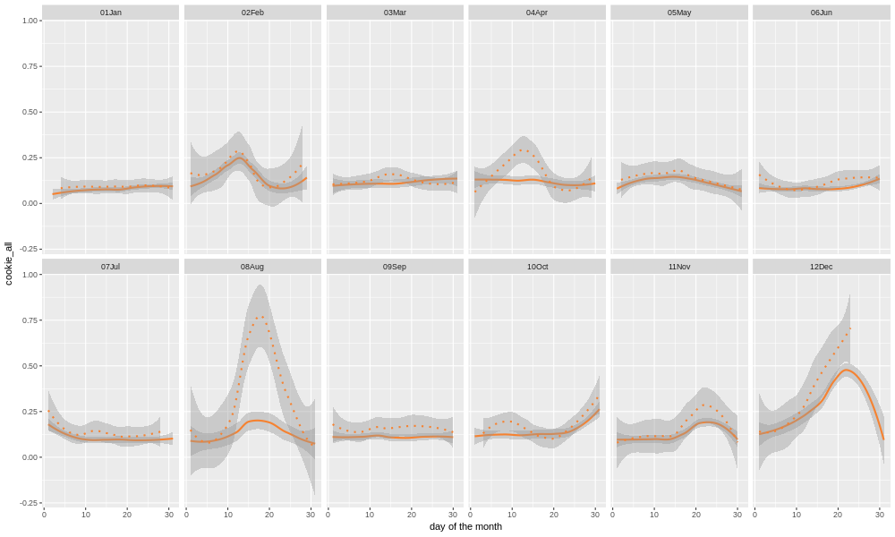
We see that there is a stronger seasonal element. In late October (Halloween), the mid-20's in November (Thanksgiving), and the runup to the 25th of December (Christmas), there is a very large diversion from the annual norm. There is also of course the mid-August back-to-school peak, and in the last 12 months of data Easter was in mid April. Cookies are, relative to beverages and deli at least, very seasonal, which makes sense.
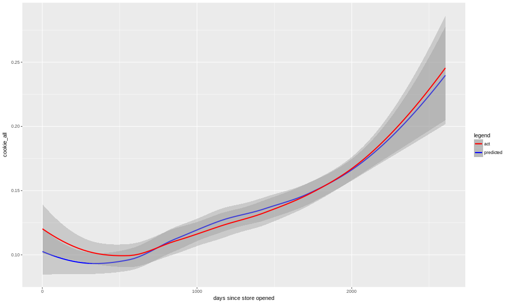
Here we see what it looks like when our model is a better fit to the data. Although there is clearly an upward trend in sales, we do not see as much of a time-dependent change in how well the model is doing. Cookie sales continue to increase over time, but our model is able to do a reasonable job of predicting it it for both old and new data. This is reflected not only in the R-squared (0.81) and adjusted R-squared (0.77) metrics, but also in the job the model did of predicting data after the cutoff date (i.e. data that it had not been trained on), which was 0.67.
Another way to see this, is to look at a "Residual Autocorrelation Plot". "Residual" means the amount of variation not explained by the model; i.e. the error or noise. "Autocorrelation" means we are seeing how well the residuals correlate with themselves, or actually with the residual from a nearby row (e.g. the next day, or the next week). Look at the residuals plots for cookies first.
The code we used to make the model analysis plots is in this function.
plot_model_analysis     <- function(c_data,target_output,model) {
    image_pathname      <- paste('./plots/',target_output,'_model_analysis.png',sep="")
    png(image_pathname, width = 1000, height = 600)
    par(mfrow = c(2, 2))
    print(suppressWarnings(plot(model,labels.id=c_data$salesdate)))
    garbage             <- dev.off()

    image_pathname_2    <- paste('./plots/',target_output,'_model_analysis_2.png',sep="")
    png(image_pathname_2, width = 1000, height = 600)
    par(mfrow=c(1,3));   #Make a new 1-by-3 plot
    print(plot(residuals(model),labels.id=c_data$salesdate))
    title("Simple Residual Plot")
    print(acf(residuals(model), main = ""))
    title("Residual Autocorrelation Plot");
    print(plot(fitted(model), residuals(model),labels.id=c_data$salesdate))
    title("Residual vs Fit. value");
    garbage             <- dev.off()
}
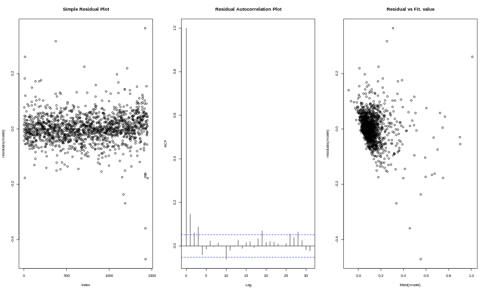
If you're not sure what you're looking at here, that's all right, there isn't a whole lot to see. The residuals bounce around a lot in the plot on the left, with no apparent trend. Most of the bars in the middle plot are between the dotted lines, which means there is no major trend. The residuals vs. fit plot on the right shows no particular trend, although you can see that the smaller the expected value (fit), the less negative the residual can be, which is partly a result of the fact that sales do not go below zero.
To compare and contrast, let's look at what happens with the beverages sales.
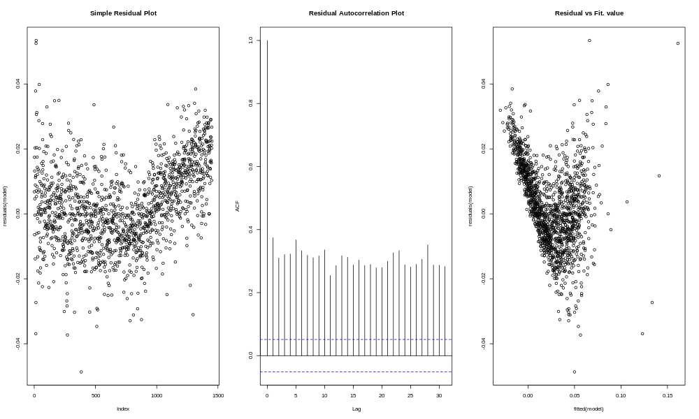
The residuals plot on the left shows a fairly clear "V" pattern, with a tendency to miss high at the beginning and end, and a tendency to miss low in the middle. The autocorrelation plot shows high autocorrelation for a lag of 1 day, 2 days, 3 days, on out to 31 days (and probably further if we had looked). Basically this is because, if the residuals are negative, it probably means you are in the time period when the model was missing high, and that means the next day, and the next day, and the next day are more likely to miss high as well. In other words, the model has long periods of missing high or missing low, instead of residuals which are as likely to be high as low.
Something similar, though not quite as pronounced, is seen with the deli sales.
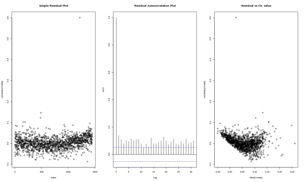
More of a mystery is what happened in a couple other categories with model results in between the extremes of beverages and deli (on the one hand) and cookies (on the other). If we look at "nonfood", for example (which involves things like greeting cards, crafts, and other gifts), we see a decline, followed by a long period of stasis, and more recently an upturn.
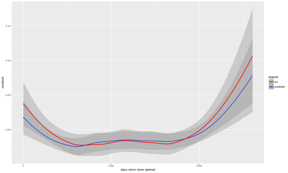
The model for nonfood was able to more or less adapt to this (R-squared 0.65, adjusted R-squared 0.55, R-squared of predictions after cutoff date 0.41). Another odd case is pastries, where the model was unable to catch an odd S-shaped pattern over time.
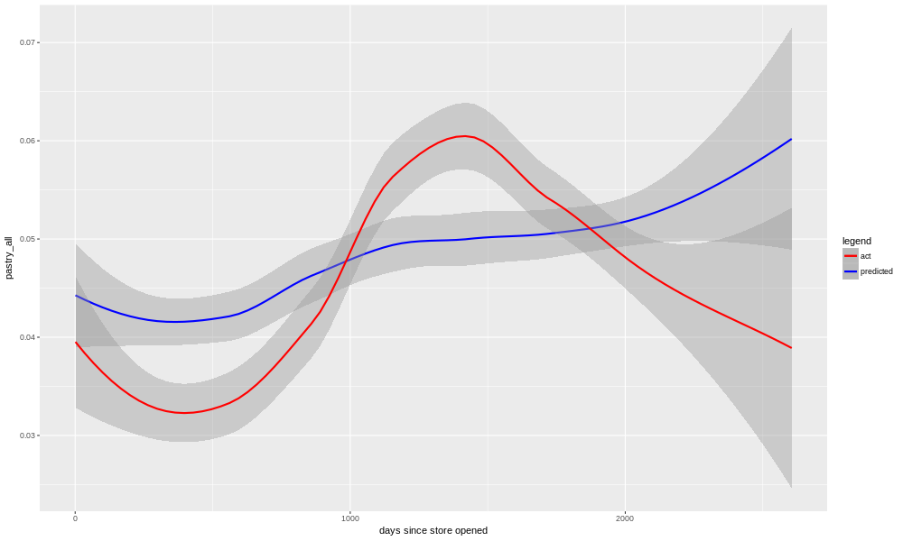
Presumably, something changed at the bakery that accounted for the long term ups and downs in pastry sales, but it's not in the information we have. We know that the model is lacking any access to, for example, weather data, and it's not too hard to imagine a heat wave or winter storm suppressing demand. What we see with pastries and nonfood, however, is a pattern that plays out over several years, and so it is unlikely to be weather (although of course different years have different weather, so it's not impossible). Another possibility is illustrated by looking at the performance of the model for total sales.
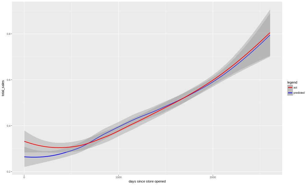
We see here not much trace of the ups and downs of the beverages, deli, nonfood, or pastry categories. This may simply be a result of all of those "errors" cancelling out, and in some sense surely that's true. But the total_sales model's performance (R-squared 0.83, adjusted R-squared 0.78, predictions after cutoff date 0.71) is superior to any of the individual categories, which raises another possibility.
It may be that, if the bakery is working harder at expanding (and pushing) their deli options and beverages, they have less energy and time left to push pastries. It may equally be that customers enter with the intention of getting a certain amount of food and drink, and if they buy deli goods and a beverage they aren't going to be as interested in a donut, pastry, or cake. This doesn't mean the restaurant's changes were not a good idea; the overall sales are going up, after all. But it does mean that perhaps the sales of the different categories aren't merely correlated, but any correlation that exists may not be positive. It's hard to tell, with time-based responses especially, when correlation is linked to any causation. Any two responses that go up over time are correlated, after all. But our human knowledge of what it's like to enter a restaurant and buy some food suggests, that our decision as to whether to have a pastry or not, is not uncorrelated to our decision as to whether to buy a sandwich. I can only eat so much, and maybe if I'm having a sandwich I want a drink with it (positive correlation), but I don't want a pastry because I'm having something from the deli instead (negative correlation).
This is an excellent example of a larger point, which is that data analysis needs to be informed with some human knowledge about what system you are modelling. It is not enough merely to have the numbers and how they correlate (or fail to); some a priori knowledge about what the system is, will help to understand what the results mean.
If we wanted to test the idea that some of the noise in each category is a result of competition between categories, probably the place to start would be to levelize the responses, or perhaps even the residuals in the responses, subtracting out the overall trend, and see if the noise that is left correlates. In other words, remove the spurious correlation that comes just from the overall time-based trend, and see if the noise from day to day shows evidence of correlation. For the moment, it is enough for the owners of this bakery to know the following:
1) Yes, the changes made in the deli and beverages categories have paid off in an increase in sales, even relative to the overall sales trend.
2) Cookies seem to be the category which is most seasonal. This is an opportunity for a good model to help guide production, giving advance warning of an expected peak in sales, and a rough estimate of how big that peak will be.
3) Keep doing what you're doing; running a bakery (or restaurant of any kind) is hard work, but you are headed in the right direction.