So, this is the story of what happened when I, a python programmer not trained as a statistician, used R to analyze the sales data for a small retail clothing store. I have scaled all the data from 0 to 1 (with 1 being the best day in the store's history), not because we needed to, but just to help make it more clear what is (for this store) a good day and what is not.
By the way, always keep a copy of your raw, untouched data. For example, if I had somehow screwed up the scaling, I would want a copy of the raw numbers to go back to in order to figure out what went wrong. Always keep a copy of your raw data, untouched, somewhere that you can easily go back to.
The scaled data csv, and all the R scripts used here, are available at this git repo.
Lesson 1 in data analysis (with R or anything else): look at your data. Not just in the aggregate, actually open up in a spreadsheet or if you have a bajillion petabytes of data then slice out a few rows using your favorite tool, and take a look at it in the raw. In my case, I saw that the SQL that I had used to export the data had put "/N" in the empty cells. This is easy to fix, but only if you know it needs to be fixed.
You can't fix what you don't know is a problem. You can't think of every potential problem your data might have, in order to check for it programmatically. You can, however, spend a few minutes to look at your data in the raw.
| salesdate | notes | total_sales |
|---|---|---|
| 2010-01-02 | 0.19223003042097855 | |
| 2010-01-03 | 0.0278870039985653 | |
| 2010-01-04 | 0.06632171845317959 |
Once you're done with that, you can load the csv into R, as a dataframe. By the way, the "tidyverse" library is a good one, you should get it.
library(tidyverse)

file_location <- "./csvs/scaled_sales.csv"
so_data <- read_csv(file_location, na = "")
Next, for every single column, check that all values are filled and valid. In my case, the column "notes" could have "" put in where there was nothing. If the column "total_sales" is empty, should it be set to 0, or should that row be thrown out? If we had a column for "tax_free_sales", putting in a 0 default would probably be safe. On the other hand, if a row had no value for "salesdate", then that entire row is bogus. You need to look at each column in turn, think about what it represents, and make sure that every value in that column is valid (that last bit can be done programmatically, of course). Yes, you are eager to get going with your analysis; do this first anyway, and don't rush. There are ways to do this on a dataframe-wide basis, but you are better off forcing yourself to look at each column individually, unless you have a bajillion columns. You can easily lose hours during analysis chasing down bogus results, because you skipped a few minutes of cleanup and checking things out beforehand.
Some R tricks that worked for me:
data$thecolumn[is.na(data$thecolumn)] <- 0
...or "" instead of 0, or whatever the appropriate default value is for that column.
data <- subset(data, data$thecolumn > 0)
...which in my case was how I rejected all rows of the dataframe "data" where the sales were 0, because in most such cases the store was actually closed on that day. I don't want to train a model to predict when the store will be closed, I want to train a model to predict what the sales will be if it is open.
data$thecolumn <- as.numeric(data$column)
...when you absolutely, positively want it to be a number
data$thecolumn <- as.Date(data$thecolumn, format = "%m/%d/%y")
...or date
data$thecolumn <- factor(data$thecolumn,
levels=c("Monday","Tuesday","Wednesday","Thursday","Friday","Saturday","Sunday"),
labels=c("1Mon","2Tue", "3Wed","4Thu","5Fri","6Sat","7Sun"))
...or categorical, i.e. a variable which can only take one of a few values. Note that you shouldn't need to put "1Mon", "Mon" should be fine, but there are a lot of plotting functions out there in R-world, and the method of telling them how to plot in a different order than alphabetical, may be different for each one. You could end up with a plot for weekdays in the order "Friday, Monday, Saturday, Sunday, Thursday, Tuesday, Wednesday". Just put a numeral in the first position of each label, in the order you want them to plot, and it's one less thing to have to figure out for every plot function you find and want to try out.
Lastly, whether you represent a particular column as numeric or categorical is not always obvious. For example, day of the month. In some sense, "15" is between 10 and 20. But, if the town the store is in has a large employer that pays people on the 1st and the 15th of each month, then it may be that representing day of the month as a category with 31 possible values is more accurate, because the 15th is qualitatively different than the 14th or the 16th. Or, perhaps representing it as a numeric value between 0 and 1 may be best, if people get paid on the last day of the month, such that the 28th of February is more like the 31st of January than it is like the 28th of January. This is one (of many) examples where you need to know something about the system that produced your data, in order to make good choices; the people who made the R packages cannot do everything for you.
For each and every column, check that it is clean now.
For numeric, do something like this:
paste('nbr of na values',sum(is.na(data$yourcolumnname)))
Where it is relevant, you may also want to look at min(data$something), max(data$something), or even sum(data$something). Basically, anything which you know should be true (all non-zero, sum to a certain value, all within a certain range, etc.) check that it is so.
For categorical/factor columns, do something like this:
paste('levels of weekday',levels(mydata$weekday))
If there are supposed to be seven days of the week present, verify that there are. If the data is supposed to be only Tuesday through Sunday, but they did open the store that one Monday for a special event, you will see that and know to remove that row that will give you a spurious result that Mondays are the best day for that store. If some values are "monday" and others are "Monday", you will see that and realize you need to capitalize (or perhaps lowercase) all values before proceeding.
For dates, do something like this:
paste('min',min(data$thedate),'max',max(data$thedate))
You know what date range this is supposed to be over, so make sure that it is all within that.
By the way, for dates, consider whether you want to break this one column up into several. For example, in my case, day of the week, day of the month, month of the year, and week of the month all have different impacts on a retail store's results. Plus, the total number of days since the store opening was relevant (the longer it's been open, the more people know about it). So, we split our one "date" column up into several categorical columns, and a couple numeric ones. In your case, you may or may not want to do this, depending on what system you are modeling.
In some cases, you want to turn a single text-based field into several different columns. Here, the column "notes" could have information about several different kinds of things. Any of "corset sale", "trunk show", "corset trunk show", etc. would indicate a particular kind of event happening that day.
so_data$corset                                           <- 0 #make a new column, all zeroes
so_data$corset[grepl('corset', so_data$notes)]           <- 1 #e.g. if 'corset sale' is in notes
so_data$corset[grepl('trunk',so_data$notes)]             <- 1 #e.g. if 'trunk show' is in notes
paste('nbr occurrences',sum(so_data$corset))
Note at the end we print out how many occurrences we found of this kind of event, so we can reality-check that with the raw data. Or, perhaps, one of the store owners.
At some point, you have cleaned up all the columns you intend to keep. It may seem like you can just ignore the others, but in some cases they can cause weird problems which are hard to debug because you aren't thinking about that column even being there (e.g. it has an NA and the function you're using chokes if there is an NA anywhere in the row). If you're not using a column, don't leave it in the dataframe.
data <- subset(data, c("list","of","columns","you","want","to","keep"))
After this, use "nrow(data)" to see how many rows you have left, i.e. how many did all the earlier filtering cause you to throw out?
There, done. You have cleaned up each column, insuring that it has all valid data of the appropriate type. So we can start the fun stuff, right? No, not quite yet.
lapply(data[c("list","of","factor","columns","you","want","to","keep")], unique))
...which will print out all the values for each of those columns. You may need to drop.levels to deal with levels whose only rows have been dropped earlier for some reason.
data <- drop.levels(data)
In my case, there was a factor for "holiday", which could have levels like "BlackFriday", "BoxingDay", "Thanksgiving", etc. Some of these (e.g. Thanksgiving) did not actually appear in the dataframe once we dropped all of the $0 days (because the store was closed on Thanksgiving). This can upset some of the R functions you will want to use, because they are trying to estimate the effect of a factor level which they have no data on. That's why we "drop.levels".
Once we have done that, it is safe to tell it which level to use as the base/comparison for each factor. For example, for the factor "holiday" we don't want it to take "ChristmasEve" as the comparison, telling us how much each holiday (including "none") is worse than ChristmasEve. We want it to use "none" for the base, and tell us how much each holiday increases the sales above that level. Here is how I did that:
holidays_found <- levels(mydata$holiday)
int_for_none   <- grep("none",holidays_found) #tells us which integer means "none"
contrasts(mydata$holiday)  <- contr.treatment(holidays_found,base=int_for_none)
The order of some of this matters, so, to recap:
It is a good idea, at this point, to save/export your cleaned, prepared data. This way, when you are tweaking the modeling part of your code, you do not have to re-run the same steps every time to clean the data. Of course, if you don't have too much data, it may not really matter, but if you have a lot of data to work with it may save you time to break this part out into its own script, and at the beginning of the second script just import the result.
Also, since we're exporting, take one last look over it, manually. If you're saving in dataframe form, just additionally save it as a csv and look at that.
write.csv(my_data,'post_clean.csv', row.names=FALSE) #this is so you can look at it yourself
saveRDS(my_data, file = "post_clean.rds")            #this is what your next script will load
At the beginning of the next R script, you will load it in with:
my_data = readRDS(file = "post_clean.rds")
This is also handy if you want to fiddle around with the dataframe manually, at the command line, perhaps before writing your next script.
The R function "ggplot" is, I have to admit, pretty powerful. Also, practically a language in itself. The number of options for how to use it could easily and productively fill a book. The reality is, you will probably figure out how to use ggplot by looking at a bunch of examples of people using it, and copying them. Here's one:
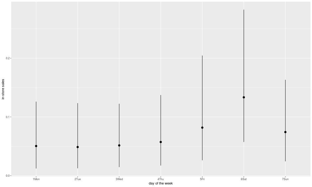
'day of the week'
png('./plots/raw_dotw.png', width = 1000, height = 600)
ggplot(data = df) +
  labs(x = 'day of the week',y = 'in-store sales') +
  stat_summary(
    mapping = aes(x = weekday, y = total_sales),
    fun.ymin = function(x) quantile(x, .10),
    fun.ymax = function(x) quantile(x, .90),
    fun.y = median
  )
garbage <- dev.off()
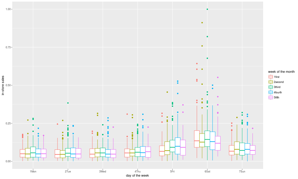
Looking at interactions is a bit trickier, but here's one way:
'dotw and week'
png('./plots/raw_by_dotw_and_week.png', width = 1000, height = 600)
ggplot(data = so_data) +
  labs(x = 'day of the week',y = 'in-store sales',colour = "week of the month") +
  geom_boxplot(mapping = aes(x=weekday,y=total_sales,color=week))
garbage <- dev.off()
So, now we can create the model for the response of interest:
mydata = readRDS(file = "post_clean.rds")
model = lm(resp_variable ~ variable1+variable2+variable3+variable4,data=mydata)
summary(model)$r.squared
summary(model)$adj.r.squared
Here, we use four input variables to model our response. But, what if variable2 is only really important when variable3 is low, and not when variable 3 is high? Or any other interaction between them. If we want to model such interactions, we can do this:
model = lm(resp_variable ~ variable1*variable2*variable3*variable4)
Now, we can get some kind of error message complaining that we don't have enough data, because we are looking at every two, three, and four variable interaction. For categorical variables, we are doing this for every level of that variable. We could use a "stepwise" method of variable selection, but there are statisticians who say this is unwise. As with response transforms, once you have many choices of what to do, picking the one that gives you the best results on your training set isn't likely to actually be that much better. As I understand it, trying a bajillion models and picking the one with the best R-squared, is kind of like "p-hacking" in science, where you are likely to end up with a model that looks good for this set of data, but doesn't generalize to any future data. Disclaimer: I am not a statistician.
However, if you know something about the system of interest, you can narrow things down a bit. For example, in my case, I know already that which week of the month (first versus third versus fifth) works differently in December (when the runup to Christmas increase sales) than in November (when the week right after Thanksgiving sees a bump). There are other months where it may differ from the usual pattern (October seems to get better as you get towards the end, due to the approach of Halloween). Again, this is not something I know statistically from the data, but something I knew before I even collected any data, from knowledge of the system that produced the data. In other cases, your knowledge of physics or chemistry or engineering or whatever may tell you which interactions are likely to be important.
Thus, I know there is good reason to suspect an interaction between week and month, so I add the "week*month" term. On the other hand, the store hasn't been at its new location a full year yet, so the interaction between month and location is not something we can look into. So I can choose which interactions to look at and which to leave out, based on some knowledge of the system we are modeling. But, if in doubt and it doesn't cause an explosion into too many combinations, leave it in and see what you get, since we are trying to learn something we didn't know. Just resist the urge to try every single possible combination, or if you do expect to need to get some additional data to validate whether your maximized R-squared is "real" (i.e. reflective of a good match to the underlying system) or "spurious" (i.e. reflective of if you try enough things one of them will appear to work in the short term, like guessing at whether a coin is heads or tails long enough and you will eventually guess right five times in a row).
I like to look at the actual values of the coefficients, although you need to use some caution in interpreting them. For example, if the coefficient for "December" is high, and the coefficient for "Saturday" is high, then when looking at the value for "Saturday&December" you need to remember that this is just telling how good Saturdays in December are AFTER taking into account that it is a December, and it is Saturday. So, it's not telling you if Saturdays in December are good, it's telling you if Saturdays in December are even better than you would expect based on December sales being good, and Saturday sales being good. Similarly with the coefficient for Christmas Eve; given that it is December, and the fourth week of the month, is Christmas Eve even better than one would otherwise expect? Or maybe worse? So, keep in mind that you're looking at the value of that one coefficient, which is part of a larger model.
Having said all that, it's worth looking at what coefficients in your model are most significant (in the statistical sense of the word):
coefficients <- round(summary(model)$coef, 4)
coefficients[coefficients[, 4] < .05, ]
| Estimate | Std. Error | t value | Pr(>|t|) | |
|---|---|---|---|---|
| (Intercept) | 0.0511 | 0.0184 | 2.7783 | 0.0055 |
| weekday6Sat | 0.0556 | 0.0253 | 2.1928 | 0.0284 |
| day_tot | 0.0000 | 0.0000 | 6.3356 | 0.0000 |
| corset | 0.3444 | 0.0274 | 12.5655 | 0.0000 |
| anniversary | 0.2906 | 0.0393 | 7.3984 | 0.0000 |
| holidayHalloween | -0.0516 | 0.0228 | -2.2686 | 0.0234 |
| tickets | 0.0228 | 0.0031 | 7.3896 | 0.0000 |
| tfw | 0.1264 | 0.0127 | 9.9541 | 0.0000 |
| sale | 0.0982 | 0.0279 | 3.5213 | 0.0004 |
| weekday6Sat:month02 | 0.1137 | 0.0345 | 3.2982 | 0.0010 |
| weekday7Sun:locsecond | 0.0144 | 0.0069 | 2.0848 | 0.0372 |
| weekday6Sat:locthird | 0.0899 | 0.0215 | 4.1857 | 0.0000 |
| week4fourth:event | 0.1654 | 0.0767 | 2.1576 | 0.0310 |
| week5fifth:event | 0.2875 | 0.0909 | 3.1623 | 0.0016 |
| weekday6Sat:week3third:month02 | -0.1177 | 0.0496 | -2.3752 | 0.0176 |
| weekday6Sat:week4fourth:month02 | -0.0962 | 0.0483 | -1.9913 | 0.0465 |
| weekday6Sat:week4fourth:month04 | -0.1061 | 0.0483 | -2.1985 | 0.0280 |
| weekday6Sat:week4fourth:month06 | -0.1063 | 0.0496 | -2.1418 | 0.0323 |
| weekday7Sun:week2second:month10 | -0.1144 | 0.0498 | -2.2990 | 0.0216 |
| weekday5Fri:week4fourth:month10 | 0.1093 | 0.0496 | 2.2056 | 0.0275 |
The first column is an estimate of the size of the effect (remember here that 1 is "the best day in the store's history"). Here, we see that whether or not the day is a Saturday is important, how many total days the store has been open is important (but the increase is so small per day that it looks like 0 here), whether we are having a corset trunk show or anniversary party is important. Halloween is actually a negative, although here we need to keep in mind that this will only be in comparison to what we might have expected for a day in the last week of October, if it were not Halloween. Selling tickets at the store for a concert helps a bit, and "tfw" stands for "tax-free weekend", which is a Texas thing that happens in August of every year. If there is a "sale" happening it increases total in-store sales, which is nice to confirm. Then, we come to the interactions.
In certain months, Saturdays are even better than normal. In certain locations, whether it is a Sunday or Saturday matters more. Events (other than corset trunk shows or anniversary parties) are more positive if they happen late in the month, especially in the fifth week (i.e. says 29, 30, or 31). There are even three way interactions: Saturdays in February may be good generally, but not quite as good if they are in the very middle of the month, in the third week. And so on.
The last column gives a measure of how likely you would be to see such an effect if it were all just randomly generated (based on the estimated size and the standard error). So, if you are looking at a hundreds of possible combinations, and you see a few at the 0.02 or 0.03 level, don't get too excited. On the other hand, the effects which register at 0.0000 in this column, are quite likely to be real, or at least not due to chance alone. Most of the three-factor interactions listed here are in the range where they might be just appearing here due to random noise, especially given that we looked at so many possibilities.
Unfortunately for me, the effect which suggests that special events work better if they occur in the fifth week of the month, is unlikely to be due to chance. For years, I had told one of the owners of the retail store in question that she should have special events in the first week of the month, when potential customers had just gotten paid. One thing about statistical analysis, is it may tell you that your pet theory is bogus. Fortunately for me, this co-owner of the store in question was very nice about it when informed of my mistake. Most likely, she knew better than to pay attention to my programmer's advice on how to run a retail clothing store, anyway.
Keep in mind that, if you looked at ten variables and twenty interactions between them, and the underlying reality is that none of your variables matter at all, you would still expect a few to show up at the 0.05 level or below, just from random chance.
Again, be wary of looking at plots of model coefficients. Because the impact of, say, "month:December" is split between being December, holiday="BlackFriday", the interaction of "monthDecember:weekdaySaturday", and so on, just looking at a plot of the coefficients for months may be actually deceptive, by suggesting that December is not all that different from other months. Really the coefficients are made for use in the model, not for human inspection via a plot, and interpreting how the impact gets split between different coefficients and their interactions can be challenging. Maybe stick to looking at raw data (or at least predictions from the model) for plots, and look at coefficients as numbers. Just my opinion, and I am not a statistician.
It might seem obvious what to analyze for, since presumably there is some target or response variable (here, the total sales for the day) that you want to predict or gain insight into. However, in some cases you may be better off trying to model some transform of it, such as the inverse, the log, or the reciprocal. In the absence of any particular theoretical reason to suspect one will work better than the other, try them all and see which works better. In systems where you have many low results, with the occasional high-flying value that's an order of magnitude greater, it may be a good idea to model the log of the response, so that those few high values don't swamp the analysis. But, it may be difficult to predict in advance if this is so.
If you look to statisticians for help on this question, you may be reminded of the part of Lord of the Rings where Frodo Baggins says, "Go not to the elves for advice, as they will say both yes and no." There are, clearly, some cases where transforming the response gives a better result. There are a lot of transforms to try, though, and any time you have a lot of options to try, the one you settle on as giving the best result for your data might just have been the best out of random luck, not because of any real underlying improvement in modeling the real-life system. In other words, it may only be better on the data you have, not any better at predicting the values of new data.
'load dataframe'
df = readRDS(file = "./dataframes/post_clean.rds")
variables     <- 'weekday+week+month+loc+event+endofmonth+day_tot+corset+anniversary+holiday+tickets+ticket_accounting+goth_ball+tfw+sale+weekday*week*month+week*month+weekday*loc+event*week+goth_ball*week+anniversary*week+week*sale'

'model of untransformed response'
response      <- 'total_sales'
model         <- lm(paste(response,' ~ ',variables),data=df)
saveRDS(model, file = "./models/lm.rds")
paste('R-squared',summary(model)$r.squared,'Adjusted R-squared',summary(model)$adj.r.squared)

'for log of total_sales'
df$logts      <- log(data$total_sales)
response      <- 'logts'
modellog      <- lm(paste(response,' ~ ',variables),data=df)
saveRDS(modellog, file = "./models/lm_log.rds")
paste('R-squared',summary(modellog)$r.squared,'Adjusted R-squared',summary(modellog)$adj.r.squared)
(etc. etc. for squared, reciprocal, square root, and any other transform we wish to try)

[1] "load dataframe"
[1] "model of untransformed response"
[1] "R-squared 0.478683846161728 Adjusted R-squared 0.413699041546478"
[1] "for log of total_sales"
[1] "R-squared 0.346650733943575 Adjusted R-squared 0.265207306404274"
So, you can do BoxCox plots and lots of other tools are available, but ultimately the only thing that will tell you for sure is if you get more accurate predictions with it, which requires getting new data. But at least take a look.
library(MASS)
png('./plots/boxcox.png', width = 1000, height = 600)
boxcox(model)
garbage <- dev.off()
By the way, the above code also shows how to save a plot for later. If you just have "dev.off()", without sending the result of that somewhere, it annoyingly prints out something to the terminal that you don't want to see. Sending the results to "garbage", a throwaway variable, is just a way to silence this.
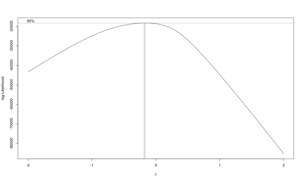
In my case, R-squared points toward using a square transform, but the Box-Cox plot points towards using inverse square root. My non-statistician opinion is that if there is not a clear case for using a transform (e.g. the BoxCox plot and R-squared results agree, or there is a theoretical reason), then stick with the untransformed response. But, if you have some fundamental theoretical reason to expect the system of interest to have a particular transform, by all means check it out.
Even better, of course, is to try them all out on new data. The untransformed response turned out to give about as good a model as any other transform, so in this case at least my non-statistician opinion turned out to be more or less correct.
There are helper functions for this, but frankly I find them more likely to cause problems than to help, so just call the predict function yourself, and then calculate the error ("residual").
data$pred_val <- fitted(model)
data$resid    <- NA
data$resid    <- data$pred_val - data$total_sales
'number we could not predict for some reason'
sum(is.na(data$resid)) #this should always be 0, but check for unforeseen problems
Once we have predictions, and a column for how far off those predictions are, we can look more closely at where we have the largest error. Here, we look at the 10 worst overpredictions and ten worst underpredictions.
head(data[order(data$resid),][c("total_sales","salesdate","pred_val","resid")],10)
tail(data[order(data$resid),][c("total_sales","salesdate","pred_val","resid")],10)
What to do about such oddball instances? Probably, nothing. But, at the very least, go look again at the raw data for them, and make sure there are no typos. It may be that there were special factors for these rows that are not included in your data ("oh, yeah, we had a special event that day"). But, if you don't know of a good reason to remove that row, leave it in. As the saying goes: "Any model can explain your data, if you remove all data not explained by your model." So, do not remove "weird" data just because it's weird.
Having looked over our worst predictions (positive or negative), and re-run our data cleaning script and model generation if there were any changes made to the data, we are ready to look at our "predictions" (here used in the odd sense of a prediction of a past value, i.e. what the model thinks a date in the past should have had for total sales). Then, we can plot predicted vs. actual sales, here against a value representing the total number of days since the store's opening.
'comparisons of raw and modeled data'
png('./plots/predicted_and_actual_over_time.png', width = 1000, height = 600)
ggplot(data = so_data) +
  labs(x = 'days since store opened',y = 'predicted in red, actual sales in blue') +
  geom_smooth(mapping = aes(x=day_tot,y = pred_val),colour='red') +
  geom_smooth(mapping = aes(x=day_tot,y = total_sales),colour='blue') +
  xlim(0, NA)
garbage <- dev.off()
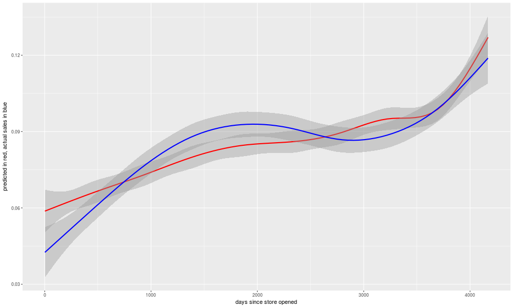
The gray zone around each line is meant to represent the range within which most of the points would fall, if we plotted the raw data points instead of the smoothed line. It's interesting to note that there are some long-lasting trends in over- or under-prediction. Perhaps these are a result of changes to the economy? But I looked into the quarterly GDP growth numbers as a possible input to the model, and it didn't seem to help any. Presumably there was something going on with the store in reality that is not captured in the inputs to the model, such as for example changes in strategy by the store's owners as to what to sell. But, overall, the model is doing well enough in its "predictions" to be worth looking at.
In theory, your model's R-squared would provide you an idea of how well your model will predict future data from the same system. But, due to the problem of "overfitting", it will tend to be an overestimate, and the more complex the model, the more likely it will overstate the accuracy of the model. One way to try to fix this is with "adjusted R-squared", which penalizes a model for complexity. Generally speaking, though, even the adjusted R-squared will be higher than the accuracy of your model at predicting future results.
There are other statistical methods of trying to estimate this, as for example by holding back a sample of your data from the model fitting, and using that sample for testing. There are also methods for re-fitting the model without a single point, and using the model to estimate that point, and then repeating this for every point in the sample. There are discussions about this among statisticians, and they are subtle and quick to anger, and basically none of it is bullet-proof. There is really only one way to know for sure if your model can predict future data, and that is to use it to try to predict future data, and see how it does.
One of the real-world reasons for this is that, no matter how powerful your statistical methods, you are making the assumption that the system you are predicting is unchanging. What if it isn't? In the case of the retail store I am looking at, the neighborhood it is in changed over time, as did the economy, and the fashion trends among the people who live there. For that matter, the store owners changed, learning what to buy and how to sell it. In almost any real-world system of interest, there are changes over time, and your model may be based on the unchanging aspects of it, but then again it may not. It may be an excellent and sound model for predicting how that system worked last year, but not work for predicting this year because the system it's modeling has changed. The only way to really know for certain how it will do at predicting results from this year, is to use it to try to predict results from this year.
I should probably break these scripts up into separate functions, and I may do that in the future, but really at the moment each script is sort of a function, that takes csv or rds files as inputs, and outputs rds or png files. R does have support for functions in the more technical sense, though, and if I were making code that I was getting paid for I would probably tidy up a bit by making it look a bit more functional. Objects/classes can be used in R, but the only place I see them used is in articles with titles like "Object Oriented Programming in R". In other words, rarely (so far in my experience, never) in code found "in the wild" to solve a real problem. This might be due to the nature of R classes, or the background of typical R programmers, or most probably both. My impression is that functional programming would be a better fit for R's use cases (and users).
To restate the lessons mentioned earlier:
Other notes, from a more purely python-programmer perspective:
So, in conclusion, there are many respects in which Python is a superior language to R. Given that, it is probably rather disappointing to many computer science types to discover that R is nonetheless superior for statistical analysis. How can this be? Python is a better designed language. Python has a large and growing user base, many of whom have done excellent work on numpy, pandas, and other math- and statistically-oriented packages. How can it be, then, that it is Python looking nervously in its rear-view mirror, as R moves into the passing lane?
Because R is where the statisticians are. Statistics is a highly unintuitive field, maybe even more so than computer science. If you pit a field of statisticians who are trying to learn programming, against a field of programmers who are trying to learn statistics, the statisticians win. I much prefer programming in Python, and yes I have used the numpy/scipy/pandas/sklearn stack, which is excellent. It doesn't matter. If you want to be in the business of doing statistically sophisticated analysis of data, you need to be where the statisticians are. Like a foreigner in a new country, try not to gripe about how things were better in the old country, and just learn to roll with the way things are here, and speak the local language, the way the locals use it. In the case of the land of statistics and statistical analysis, that language is R.